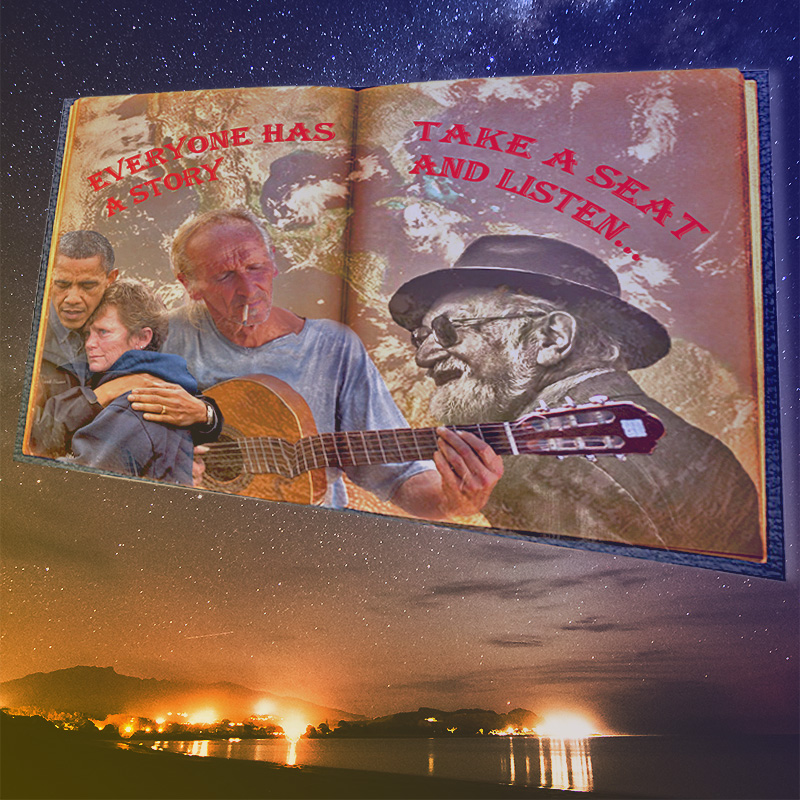
The design inspiration for this project has gone under major reconstruction. Easily seen by comparing the draft to the final product. With credit to the overhaul being attributed mainly to the comment section of my latest draft post. There was a lot to be desired when looking at my draft picture. Sharpening of the whole image in general seemed to be a consensus among the comments. That being the main concern as well as empty space not being used, the job was easier said then done. Luckily, everyone seemed to understand what the poster was conveying. Showing at least a proof of concept on the idea.
The final process began with a new background, something to make the book stand out more then just the old paper filling empty space in the draft. And finding the appropriate image for a background on Flickr was harder than first imagined. Finally coming across the perfect star filled night sky. Moving onto the actual image was the main part of this project. And with comments given, it seemed inappropriate to have to change up the concept and elements but instead just shine it up a bit, with special detail to blurriness on the images. And so, I began, restarting the book and everything on the page from the ground up. Using the lasso, smart eraser to perfectly cut out the book and each image. After agonizingly cutting out each image, pixel by pixel, it started to take shape. Putting slightly less opacity on each image as that was another one of the concerns. In hope that it would make the images of people pop up harder against the earth background.
With the images placed correctly on the book, the new type was added on, giving a bit more of a slight curve to the lettering. After the book was together, I took the liberty to merge the images before the next step. With the book being stuck together with all appropriate images/text, I could change the image perspective to add the tilt. Adding the tilt gave the image a bit more life, seemed to add some slight amount of character to the cover page of the video journal. Once the image started to come together, adding a gradient and messing with hue, saturation and color balance only seemed necessary.
The meaning behind each image is abstract in their own way. Its hard to select images that can show emotion, but I feel all four people placed on the book do. You wouldn’t know it but the women hugging Obama had just lost loved ones and a home to hurricane Harvey. The other two people are more for visual stimulation, depicting people who look like they have a story to tell. Hoping that all these images can now correctly. With edits and revisions inspired by the comments of my last post. Thanking everyone who left comments on the draft post!
1.Gallery, Cuba. “People.” Flickr. Yahoo!, 28 Aug. 2009. Web. 13 Sept. 2019.
2. Mini_malist (off Is the New On). “People_22.” Flickr. Yahoo!, 12 Sept. 2013. Web. 13 Sept. 2019.2.

Click image to access URL
3. Aghassi, Doug. “Open Book, Blank.” Flickr. Yahoo!, 15 Nov. 2011. Web. 13 Sept. 2019.
4. Gill, Kevin. “Earth.” Flickr. Yahoo!, 04 Mar. 2015. Web. 13 Sept. 2019.
5.Hall, Tom. “Star.” Flickr, Yahoo!, 28 Sept. 2014,
