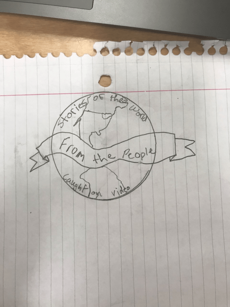
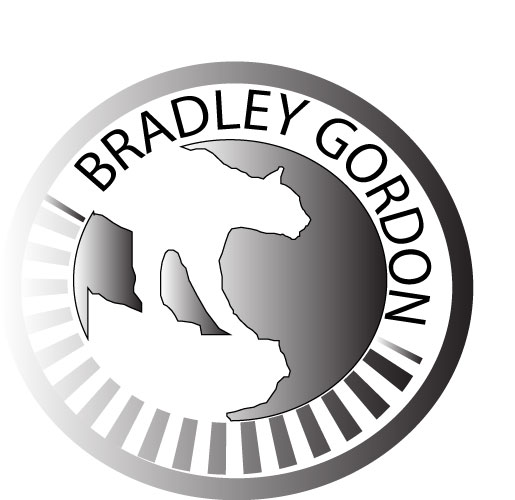
When designing the logo for this project, I had to take a few days to think about what would best fit the project. It being the start to a video journal, it defiantly needed to be a little bit ambiguous. Starting off by tracing a map of the earth using the pen tool. With help from some YouTube videos, I was able to figure out how to warp the traced map to fit the globe and show some of the depth that the earth would have. When thinking what the rest of the design should be, thinking of what words I should use was crucial. Eventually landing on “Stories of the world, for the world, by the world” with the words descending through the globe, hopefully having readers eyes follow them down the page.
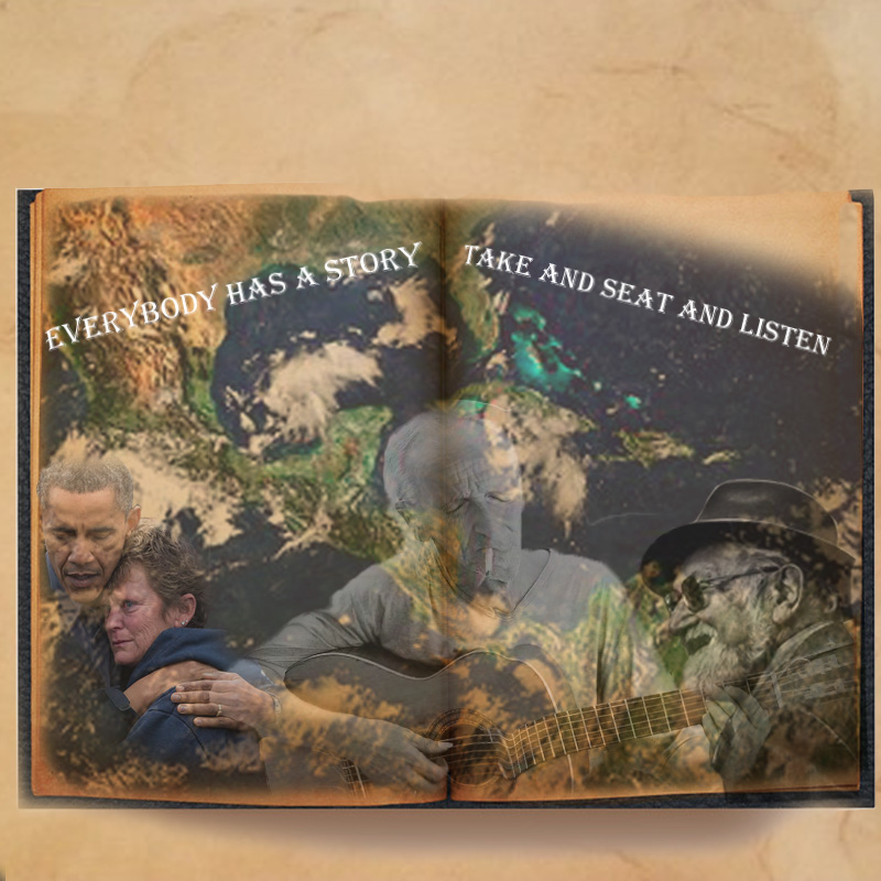
Moving on to the background and empty space was the next portion of the project. With it being the draft, I was just trying to figure out what could possibly go in the space, choosing stars that I will for sure have to double back and shine them up a little for the final draft of the project. Knowing I was most likely going to go back and start the final draft from the ground up. A little pessimistic but knowing I must go back and re-do the project leaves room for a lot of improvement and extra artistic possibilities.
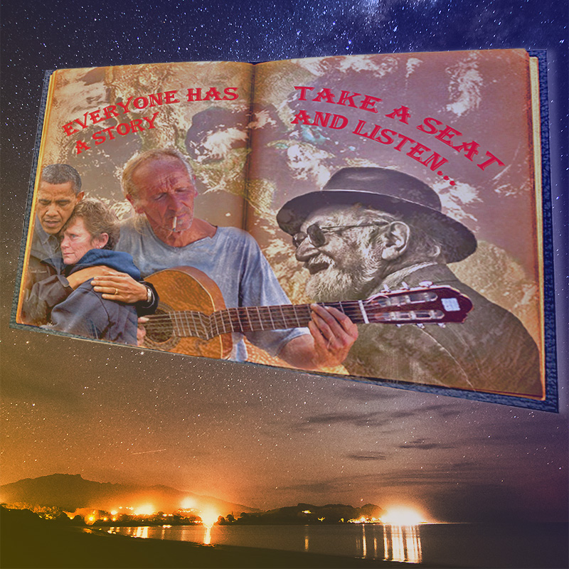
Playing around with different effects in illustrator was by far the most enjoyable part. Using the flare tool, warp and different color offsets could change the image dramatically. There was a point after the project where I seemed stuck, wondering where I could take this project. And how I could incorporate the logo and cover page. But stamping them on the front of the video journal/interview was the result. Using them as a sort of supplementary images.
Self Review-
After looking at all the other logo projects, there are definitely things I want to improve in. As well as reading comments left for me. I feel like I need to condense my whole logo into well, more of a logo. I’m seeing now how big and filled with random stuff it is. I think ill do this by almost taking the whole background out. The Sun flare was cool, but really not necessary. I will also condense the lettering and focusing more on the earth being the background. That also means I will have to do a much more precise job with outlining the continents in the very first step. Rounding out coroners of countries and overall more attention to detail. I think the wording on the logo can stay but it will need a few updates to its design. Putting more work into presenting it front and center of the image. I think with a few more hours into this it can be looking more like a logo and less of a low-quality picture. Filling in the empty space and adjusting the whole layout of the logo. The revamped version coming soon!